
2025-09-30 14:03:04
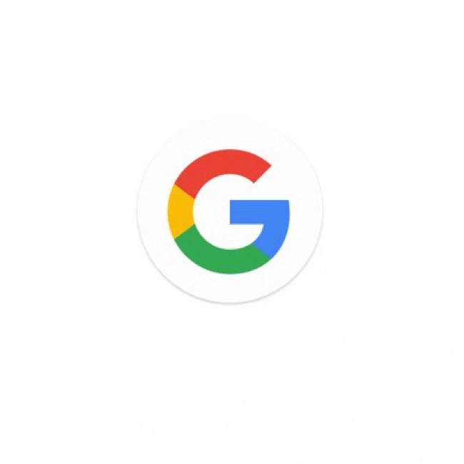
Google has refreshed its famous ‘G’ logo, unveiling a brighter and more colourful version designed to make it clearer and more consistent across screens.
The update, announced in a blog post, introduces stronger gradients and sharper hues of blue, red, yellow, and green.
Google says the change is intended to improve accessibility and visibility, particularly on smaller devices like smartwatches, as well as in dark mode where the old tones could sometimes appear muted.
The redesign keeps the familiar shape of the ‘G’ but enhances its contrast so it stands out more effectively against both light and dark backgrounds.
According to Google’s design team, the goal was to preserve recognisability while ensuring the logo looks “fresh, modern, and easy to read in any context”.
Beyond aesthetics, the refreshed logo also reflects a broader design strategy at Google.
Over the past year, the company has rolled out Material You updates across its apps and services, standardising visual elements to make them feel more unified.
The new ‘G’ is part of that process, ensuring consistency from Android devices to Chrome and Workspace products.
While subtle, the change has sparked plenty of reaction online – some users praised the sharper colors for making the icon easier to spot, while others argued the update was barely noticeable.
Google noted that the redesigned ‘G’ will begin rolling out immediately across its ecosystem, replacing the old version wherever the icon is used, from app launchers and search bars to email avatars.
The new look marks the latest in a series of logo adjustments since Google introduced the multi-coloured ‘G’ in 2015, underscoring the company’s ongoing effort to keep its branding both familiar and future-facing.
Visit Bang Premier (main website)


